As a part of my graphic design mentorship, I created a new corporate identity for an existing product. I decided to choose After Shock, a cinnamon alcohol. I was inspired to pick this because the alcohol is a favorite of my mother's, but has been incredibly difficult to find. A new look and marketing could very well help push the drink's awareness up. I also think the original logo was a bit bland and had some design flaws, so a new look would really help.
I took a look at multiple types of alcohol, as well as the drink itself. After Shock is most commonly seen as a party drink, which makes sense since it's a cinnamon alcohol with sugar crystals on the bottom. With this knowledge, it makes sense to market it to the younger side of the drinker spectrum, such as millennials and college students. As such, I wanted to create a logo with more energy and attitude. I created three rough sketches of different logos, which I went over with my mentor. Out of all three designs, we chose this one.
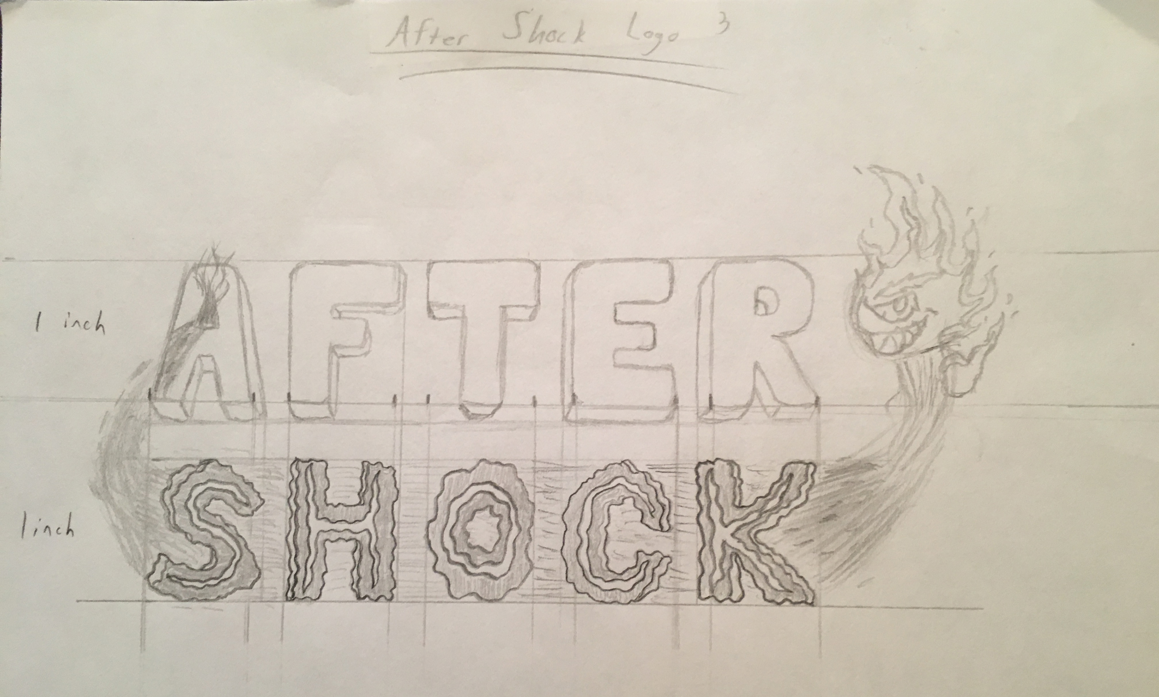
I was inspired by more lively beverages like energy drinks, as well as a bit of inspiration from video game logos to tie it somewhat into my illustrative abilities. I wanted to capture both the slight innocence of the sugar crystals of the drink, to the overall intensity of it's spicy flavor. This is shown by the normal type of "AFTER", leading into the intense "SHOCK" made up of intense burn marks. This is followed by a mascot character, a devious fire creature. This not only adds attitude, but also creates a simple image that can be easily associated with the drink itself.
Later, I recreated the logo digitally, resulting in the following:
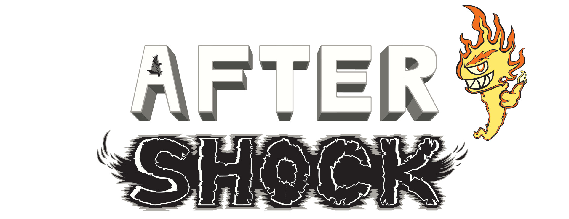
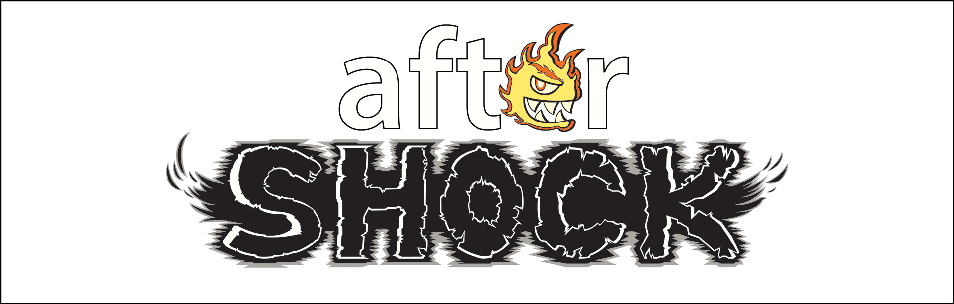
After working with this logo a bit, it became apparent that the "AFTER" was too prominent. This drew more attention away from the "SHOCK" and the mascot then necessary. The next rendition of the logo used lower case letters for "SHOCK", as well as incorporating the mascot into the logo more:
The final result moved the mascot into "SHOCK", in order to fully emphasize attention onto "SHOCK". "AFTER" was also altered to be slightly behind "SHOCK", in order to create a much more effective flow for the logo. This resulted in the final rendition of the After Shock logo:
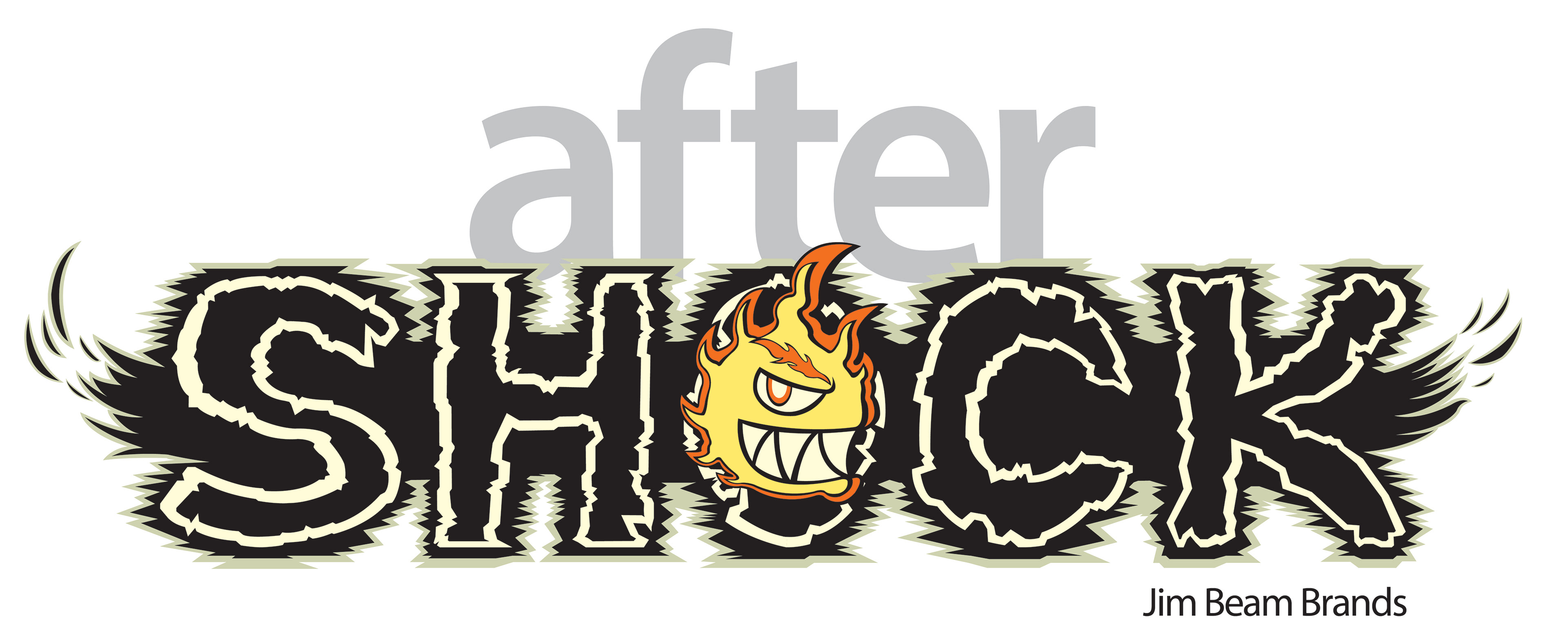
The final logo captured all the ideals of the original logo, while updating it to be more streamlined and have a more effective way to direct attention where it should be.